
Highlights
- Reactive design accounts for 37.7% longer visits on mobile websites in 2023.
- Reactive web design offers a unified approach, reducing development and maintenance costs.
- Google prioritizes mobile-friendly sites in search rankings.
- Reactive web design meets these criteria, boosting your SEO and driving more organic traffic.
- Reactive websites enhance user engagement and conversion rates.
Ever visited a website on your phone and had to zoom in and out just to read the content? Or maybe you’ve struggled with a website that looks great on a desktop but is a mess on a tablet? If these scenarios sound familiar, you’ve experienced the frustration of poorly designed websites that don’t adapt to different devices.
So, what’s the secret behind websites that adjust smoothly to any screen size? That’s where Reactive Web Design comes in. In this blog post, we’ll break down reactive web design and how it can transform how your website looks and works on all devices.
What Is A Reactive Web Design?
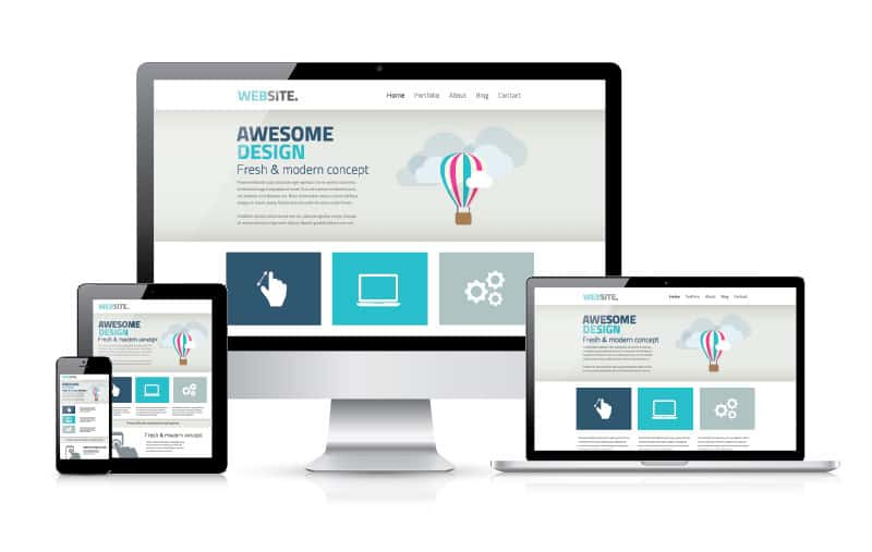
Reactive web design, often called adaptive web design, is a framework that ensures a website functions and displays well across various devices and screen sizes.
The goal is to create seamless usability regardless of whether the website is accessed on a desktop computer or smartphone. As mobile technology transforms the digital landscape, it’s reshaping how people search online.
Semrush reports that in 2023, mobile websites saw an incredible 37.7% longer visits than desktop sites. This highlights the necessity of having a mobile-responsive website to drive more traffic.
Moreover, Google says that mobile-friendly websites are essential for better search engine rankings.
In today’s mobile-first world, reactive web design (RWD) is crucial. With the growing use of smartphones and tablets, users demand websites that are easy to use and responsive on their devices.
Now, the next question that may come to your mind is:
Are Reactive And Responsive Web Designs The Same?
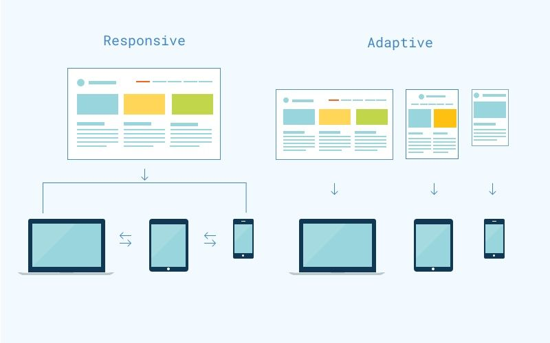
The answer is No! Responsive websites automatically adapt to fit the screen of any device, whether a computer, tablet, or smartphone, so they look good on all of them.
A reactive website, however, offers different versions for different devices. For example, there might be one version for computers and a separate one for smartphones, each designed specifically for that device.
This is the main difference between reactive and responsive web design. For a more in-depth comparison, keep reading.
What’s the Difference between Responsive and Reactive Design?
| Aspects | Responsive | Reactive |
| Layout Adaptation | Utilizes fluid layouts with percentage-based dimensions for flexibility. | Pre-designed layouts tailored to fit specific device screens. |
| Images & Media | Images, videos, and other media resize and adapt to different screens. | Media is optimized and customized for each type of device. |
| Navigation | Navigation menus and elements are designed to be mobile-friendly and adaptable. | Navigation is specifically customized for each device type. |
| Performance | All assets are loaded regardless of the device, potentially leading to slower performance on mobile. | Loads only the assets relevant to each device, improving performance. |
| Development | Simplified development with a single codebase and adaptable components. | More complex, involving separate templates and components for each device. |
| Analytics | Provides aggregated traffic data with options to analyze by device type. | Offers detailed analytics with separate tracking for each device version. |
| Development Frameworks | Commonly used CSS frameworks like Bootstrap for layout adjustments. | Often utilizes JavaScript frameworks such as React, Angular, or Vue for dynamic updates. |
| User Experience | Delivers a consistent experience that adapts fluidly across devices. | Offers a tailored user experience optimized for each device type. |
| Content Arrangement | Content is rearranged responsively based on the device’s screen size. | Pre-rendered pages are arranged according to the specific device’s layout. |
| SEO | Avoids duplicate content issues with a single, unified URL structure. | May face duplicate content issues, requiring 301 redirects and canonical tags. |
| Content Synchronization | Easy to manage as content is the same across all devices. | More challenging due to the need to synchronize content across different templates. |
| Styling & CSS | Employs media queries to adjust styling for various screen sizes. | Applies customized styles based on device detection. |
| HTML Code | Consistent HTML code is used across all devices. | Different HTML versions are served depending on the device. |
How Is a Reactive Website Designed?
When designing reactive websites, elements such as fluid grids, adaptable images, and media queries are essential. These components work together to ensure the layout and content seamlessly adjust to different screen sizes and devices.
Let’s discuss how these elements contribute to creating a reactive design.
Flexible Grid Layouts
The grid system scales proportionally instead of using fixed-width layouts. This means elements resize fluidly with the browser window.
Flexible Images and Media
Images, videos, and other media elements are scaled according to the viewport size to prevent them from being larger than their container.
CSS Media Queries
CSS media queries apply different styles depending on the device features, such as screen width, height, and orientation. This allows for different layouts on different devices.
Fluid Grid System
Elements are given relative units (percentages) rather than fixed units (pixels). This helps maintain the layout proportions across different screen sizes.
How Reactive Website Design Works?
Here’s how reactive design works:
- Viewport Meta Tag
The <meta> tag in the HTML head section controls the layout on mobile browsers. For example, <meta name=”viewport” content=”width=device-width, initial-scale=1″> ensures the page width is the same as the device width.
- Responsive Images
Images are styled with max-width properties to ensure they don’t overflow their container, adapting to different screen sizes.
- CSS Media Queries
CSS media queries enable the website to detect the screen size and apply the corresponding styles. Example:
@media (max-width: 600px) {
body {
background-color: light blue;
}
}
This example changes the background color when the screen width is 600px or less.
- Breakpoints
Strategic points where the layout changes to accommodate different screen sizes. Common breakpoints include:
- 320px: Small devices like smartphones.
- 768px: Tablets.
- 1024px: Small desktops and large tablets.
- 1200px: Large desktops.
- Testing and Iteration
Now, test on various devices and screen sizes to ensure a consistent and user-friendly experience. Tools like Chrome DevTools or online services like BrowserStack can simulate different devices.
What Is Better for Your Website in 2024: Reactive or Responsive Design?
In 2024, reactive web design is essential for ranking high on SERPs, outshining competitors, and achieving online business success. Let’s discuss the benefits of adopting reactive web design today:
- Boost User Experience (UX)
Reactive design delivers a seamless and optimized experience across all devices—desktop, tablet, or mobile. With RWD, users no longer need to zoom or scroll horizontally, ensuring a more intuitive and enjoyable browsing experience.
- Affordable Solution
Maintaining separate websites for mobile and desktop can be both time-consuming and costly. Reactive web design offers a unified, cost-effective solution by eliminating the need for multiple sites. This approach cuts off development and maintenance costs while ensuring a consistent brand experience across all devices.
- Optimize SEO Performance
Search engines, especially Google, prioritize mobile-friendly websites. Reactive web design ensures your site meets these criteria, improving your search rankings and attracting more organic traffic.
- Increases User Engagement
A reactive website enhances user engagement and conversion rates. Easy navigation and interaction encourage users to spend more time on your website and increase conversion rates.
Final Words
Reactive web design is not just a trend but a necessity in today’s mobile-first world. By ensuring your website adapts seamlessly to any device, you can enhance user experience, reduce costs, improve SEO performance, and increase user engagement. Using reactive design will position your site for success, driving more traffic and conversions in an increasingly digital landscape.
Also, if you’re looking for a software company to create a highly customer-centric site using a reactive web design approach, Tambena Consulting is your best choice. We are a leading software agency helping businesses generate greater revenues and attract more customers.