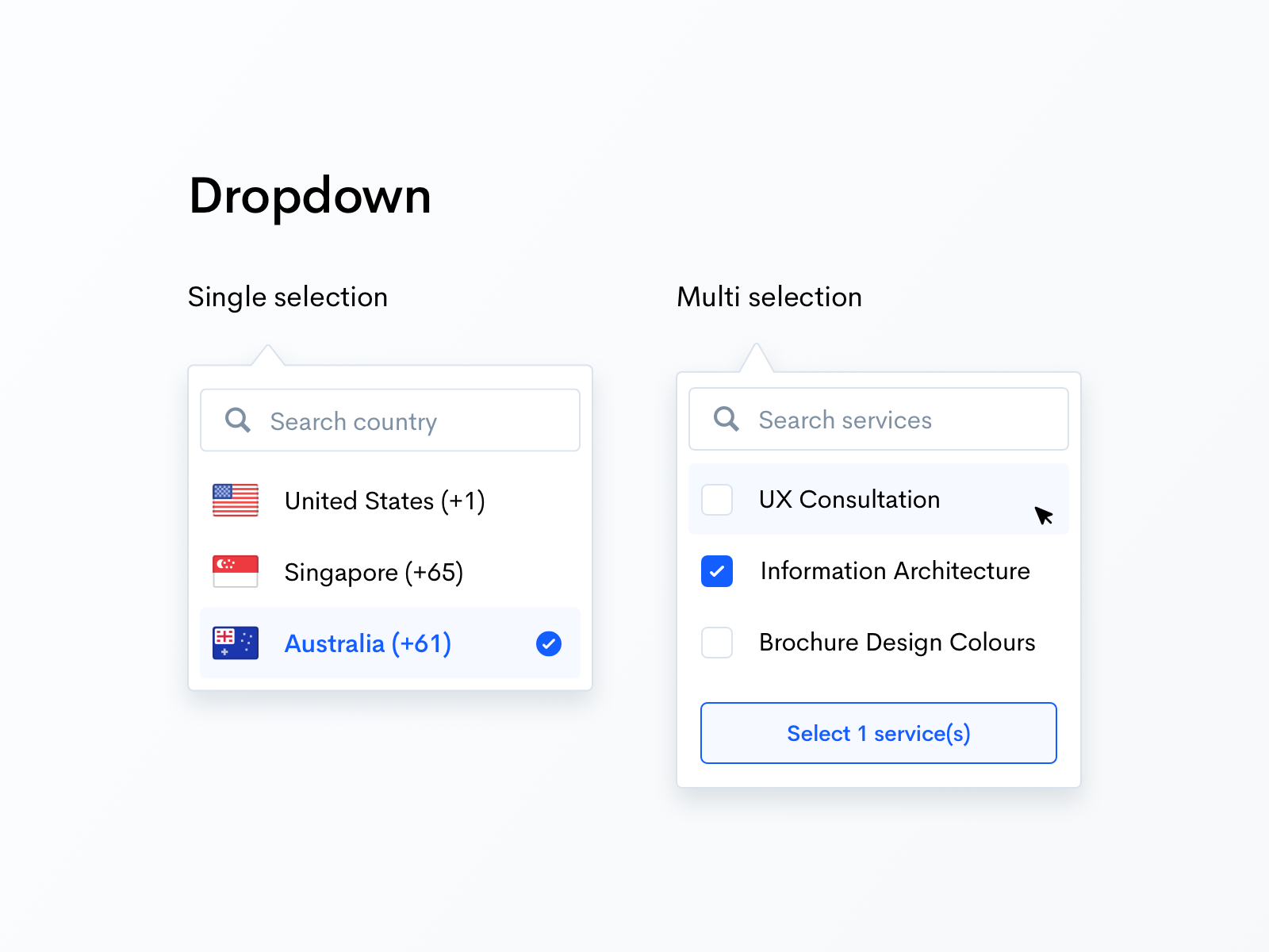
The creation of a dropdown is a common feature in many web applications. Mostly, these applications use Vue javascript for this creation. It is a great tactic to enhance the user experience as users can select the option as they type into a search bar. This can be used for:
- Auto-complete functionality
- Search suggestions
- Option selection from a list
In this article, we’ll see how to make a dropdown from the search bar Vue. We’ll cover the basic setup with search functionality displaying results in a dropdown, and handling user interactions. This is for informational/educational purpose, so if you want expert services you can rely on Tambena Consulting’s development services.
Anyway, let’s start with details:
Setting Up the Vue Project
First of all your computer should have Vue CLI installed. If you don’t have one, you can install it through:
· npm install -g @vue/cli
Create a new Vue project
· vue create search-dropdown
Navigate into the project directory
· cd search-dropdown
You can run the project using
npm run serve
Basic Component Structure
In the “src/components” directory, create a new component named “SearchDropdown.vue”
<template>

  <div class="search-dropdown">

<input

      type="text"

      v-model="searchQuery"

      @input="onSearch"

      @keydown.down.prevent="onArrowDown"

      @keydown.up.prevent="onArrowUp"

      @keydown.enter.prevent="selectItem"

      @blur="closeDropdown"

      placeholder="Search..."

/>

<ul v-if="isOpen && filteredItems.length" class="dropdown-list">

   <li

        v-for="(item, index) in filteredItems"

        :key="index"

     :class="{ 'highlighted': index === highlightedIndex }"

        @mousedown="selectItem(item)"

   >

     {{ item }}

   </li>

</ul>

  </div>

</template>

<script>

export default {

  data() {

return {

   searchQuery: '',

   items: [], // This should contain the list of items to search from

   isOpen: false,

      highlightedIndex: -1,

};

  },

  computed: {

filteredItems() {

   if (!this.searchQuery) return [];

   return this.items.filter(item =>

        item.toLowerCase().includes(this.searchQuery.toLowerCase())

   );

}

  },

  methods: {

onSearch() {

   this.isOpen = true;

      this.highlightedIndex = -1;

},

onArrowDown() {

   if (this.highlightedIndex < this.filteredItems.length - 1) {

        this.highlightedIndex++;

   }

},

onArrowUp() {

   if (this.highlightedIndex > 0) {

        this.highlightedIndex--;

   }

},

selectItem(item) {

   this.searchQuery = item || this.filteredItems[this.highlightedIndex];

   this.isOpen = false;

},

closeDropdown() {

   this.isOpen = false;

}

  },

  mounted() {

// Mock data, you can replace this with your actual data

this.items = [

   'Apple',

   'Banana',

   'Grapes',

   'Orange',

   'Pineapple',

   'Mango',

   'Watermelon'

];

  }

};

</script>

<style scoped>

.search-dropdown {

  position: relative;

  width: 300px;

}

.search-dropdown input {

  width: 100%;

  padding: 10px;

  border: 1px solid #ccc;

  border-radius: 4px;

}

.dropdown-list {

  position: absolute;

  top: 100%;

  left: 0;

  width: 100%;

  border: 1px solid #ccc;

  border-top: none;

  border-radius: 0 0 4px 4px;

  background: #fff;

  max-height: 200px;

  overflow-y: auto;

  z-index: 10;

  list-style: none;

  padding: 0;

  margin: 0;

}

.dropdown-list li {

  padding: 10px;

  cursor: pointer;

}

.dropdown-list li.highlighted {

  background-color: #f1f1f1;

}

</style>
Breaking Down the Code
Template Section
Input Element
· v-model=”searchQuery” binds the input value to the “searchQuery” data property.
· @input= “onSearch” triggers the “onSearch” method whenever the user types in the input.
· @keydown.down.prevent=”onArrowDown” and @keydown.up.prevent=”onArrowUp” handle arrow key navigation in the dropdown.
· @keydown.enter.prevent=”selectItem” allows the user to select the highlighted item using the Enter key.
· @blur=”closeDropdown” closes the dropdown when the input loses focus.
Dropdown List
· v-if=”isOpen && filteredItems.length” displays the dropdown list only if it’s open and there are filtered items.
· v-for renders each filtered item.
· :class=”{ ‘highlighted’: index === highlightedIndex }” highlights the currently selected item.
· @mousedown=”selectItem(item)” selects the clicked item.
Script Section
Data Properties
· searchQuery: It carries the current value of the search input.
· items: It carries the list of items to search for.
· isOpen: It controls the visibility of the dropdown.
· highlightedIndex: It tracks the currently highlighted index.
Computed Properties
· filteredItems: It operates to return the list of items that match searchQuery.
Methods
onSearch: In this method you will open the dropdown and reset the highlighted index when the user types
onArrowDown: This will move the highlight down in the dropdown.
onArrowUp: This will move up in the dropdown.
selectItem: You will select the highlighted item or the clicked item.
closeDropdown: It closes the dropdown when the input loses focus.
Mounted Hook
This is the step where we populate the “items” array with simple data. You have the authority to replace it with an API call or your own data source.
Adding an API Call for Dynamic Data
This is an optional method to do if you want to fetch the dropdown items dynamically. You can use “onSearch” method to make an API call.
javascript

methods: {

  onSearch() {

this.isOpen = true;

    this.highlightedIndex = -1;

// Replace the following URL with your actual API endpoint

    fetch(`https://api.example.com/search?q=${this.searchQuery}`)

   .then(response => response.json())

   .then(data => {

     this.items = data.results; // Adjust based on your API response structure

   });

  }

}
Styling the Dropdown
As for the design, you can adjust the CSS in the “<style>” section. The current CSS will provide a simple, functional design for the dropdown.
Integrating with the Parent Component
If you want to integrate `SearchDropdown.vue` into a parent component, you can do so as follows:
In your “App.vue”
<template>

  <div id="app">

<SearchDropdown />

  </div>

</template>

<script>

import SearchDropdown from './components/SearchDropdown.vue';

export default {

  components: {

SearchDropdown

  }

};

</script>

Handling Search Results and Events

For selected items handled in the parent component, you need to emit an event from “SearchDropdown.vue”.

javascript

methods: {

  selectItem(item) {

this.searchQuery = item || this.filteredItems[this.highlightedIndex];

this.isOpen = false;

    this.$emit('item-selected', this.searchQuery);

  }

}

In the parent component:

vue

<template>

  <div id="app">

<SearchDropdown @item-selected="handleSelection" />

  </div>

</template>

<script>

import SearchDropdown from './components/SearchDropdown.vue';

export default {

  components: {

SearchDropdown

  },

  methods: {

    handleSelection(selectedItem) {

      console.log('Selected item:', selectedItem);

}

  }

};

</script>
Conclusion
The above coding guide was the answer to how to put a dropdown inside the search bar vue. You can expand it by integrating it with other APIs. Then it will be able to handle complex data or style the dropdown further.
If you are not here to develop such a dropdown on your own then you can rely on Tambena Consulting. Our developers have a knack for providing work that is in line with your demands, technology, and trends. So, you can have more advanced features like auto-complete, predictive search, or multi-select dropdowns from is.


